If you're looking for visual strategies for your brand.com, we have a separate article here. In this one, we will focus on how to make your product imagery stand out on marketplaces like Lazada, Tokopedia, Shopee, and more.
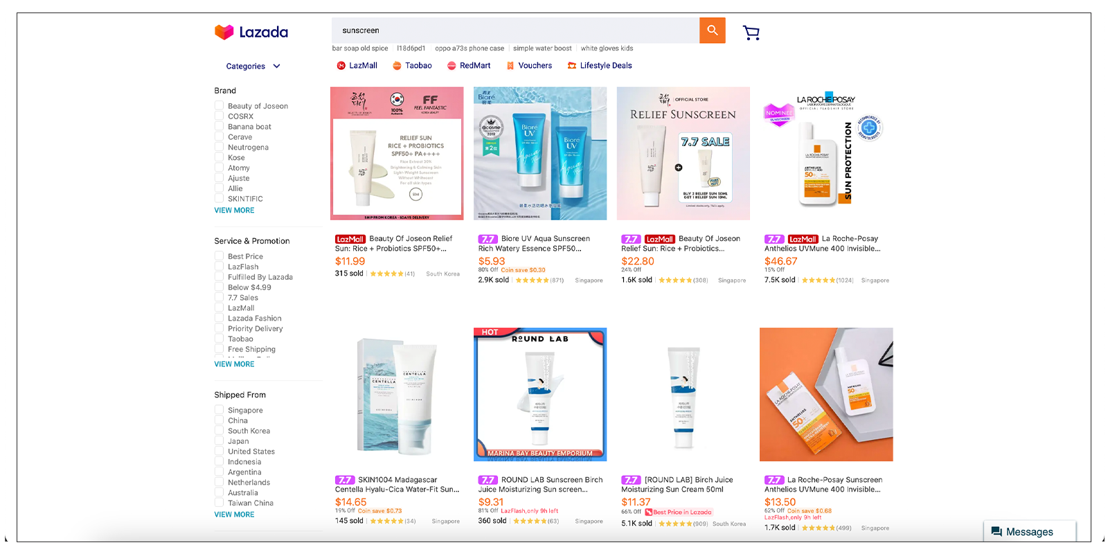
Before diving into detailed tips and examples, it's important to understand buyers' behavior on marketplaces. Most of the time, shoppers don’t search for a specific brand name. Instead, they type in the product name like “sunscreen“ or sometimes ideas, like "gift for Father’s Day." Here’s what shoppers see once they search on marketplaces:

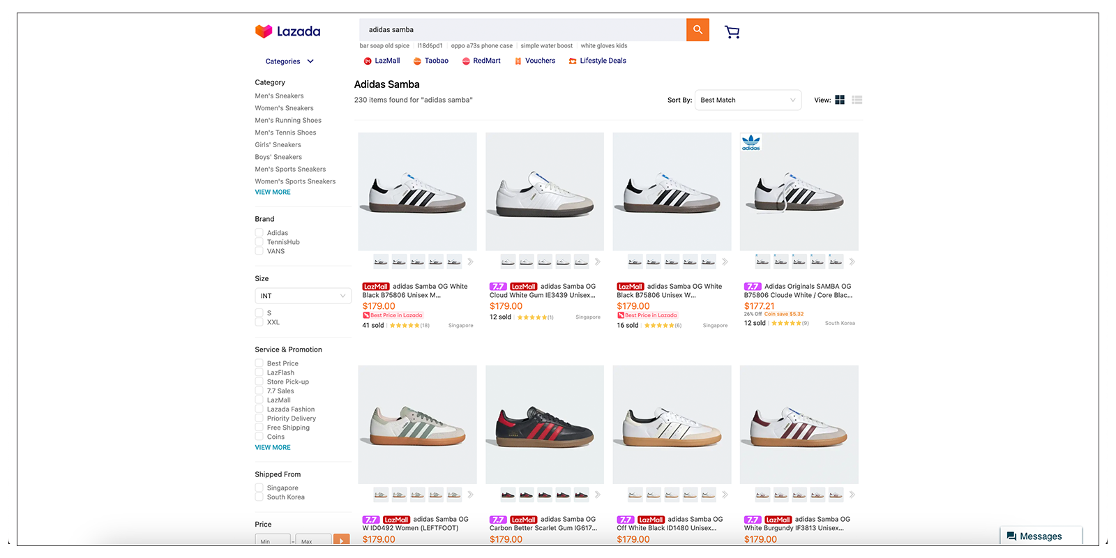
As you can see from above, your product is always competing with others. Lazada is becoming increasingly competitive, with over 125,000 sellers vying for page views. As a Lazada seller, you need to distinguish yourself from the competition by creating product listings that emotionally resonate with buyers. Making your product listing images outstanding is the first step to boosting sales on these marketplace platforms.
Product listing on Lazada, Shopee, Tokopedia
In case you are new to online business, here are several definitions based on where to show your product images on marketplaces:
-
Main product images
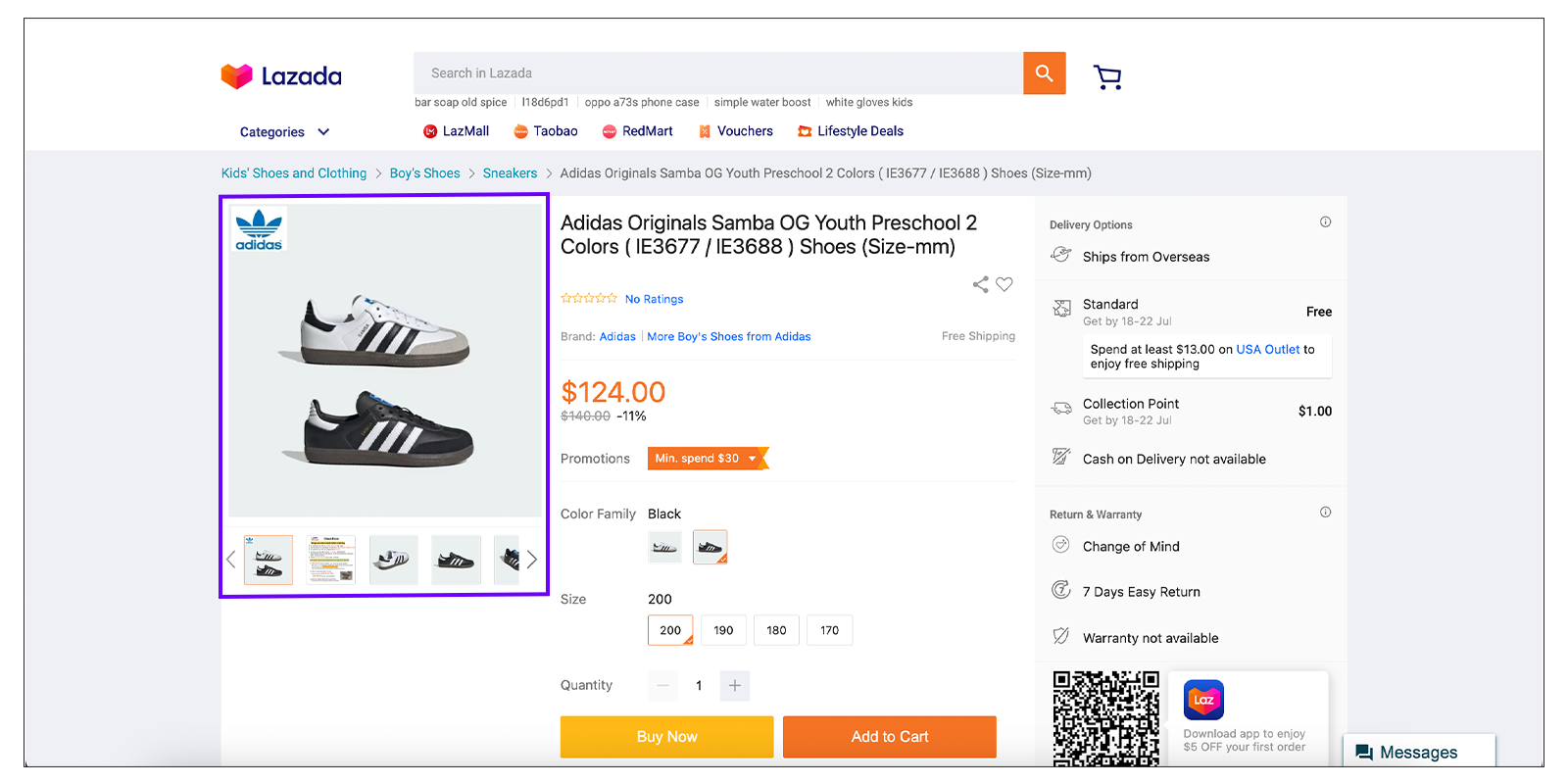
These are the main images that will be displayed on the Product Display Page. On Lazada, you can upload up to 8 images to the main product images. Ensure your upload visuals are in a story-telling sequence, and the background is clean, preferably white, to keep the focus on the product itself.

-
Variant images
Variant images showcase different versions of your product, such as different colors, sizes, or styles. Ensure consistency in how these variants are presented to maintain a cohesive look across your product listings.
-
Buyer promotion images
The buyer promotion image is a picture of your product displayed across various parts of the platform, including search results, product recommendations, and other areas featuring promoted items. You can select only one image within an SKU to serve as the buyer promotion image. Its main goal is to capture the attention of potential buyers and encourage them to click on your product for more information. Promotion images highlight any discounts, offers, or special deals. Use bold and contrasting colors to make these images pop. Incorporate text overlays to communicate the promotion clearly, but keep the design uncluttered.

Tips for a more eye-catching listing image on the marketplace
-
Design a branded / festive theme frame
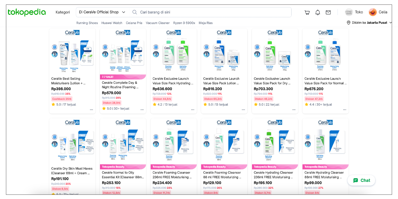
Using a branded frame around your product images can help reinforce brand recognition. During festive seasons, incorporating relevant themes can attract more attention. For example, adding a Christmas-themed border during December can make your product more appealing.
-
Add a brand logo
Including your brand logo on all your images helps with brand recall and establishes trust with potential buyers. Make sure the logo is visible but not overpowering. 
-
Create infographic product thumbnails
Infographics can communicate essential product information quickly, especially when you are selling consumer electronics or home appliances. Consumers tend to care more about the functions, specs, and warranty. Highlight key features, benefits, or usage instructions in a visually appealing manner. This is particularly useful for complex products that need a bit more explanation.
-
Display different angles / colours
Showing your product from various angles can give shoppers a better understanding of what they are buying. If your product comes in different colors or styles, include images of these variants. This not only provides more information but also caters to different preferences, increasing the likelihood of a purchase.
-
Use lifestyle images
Lifestyle images show your product being used in real-life situations. These images can help shoppers visualize how the product fits into their lives, making it more appealing. For instance, if you’re selling kitchen gadgets, show them in use in a beautifully set-up kitchen.
-
Highlight unique selling points (USPs)
Make sure your images highlight what sets your product apart from competitors. If your product is made from premium materials or has a unique feature, showcase it prominently.
-
Consistency is key
Maintain a consistent style across all your product images. This creates a professional look and helps build brand recognition. Consistency in lighting, background, and image quality is crucial.
-
Test and optimize
Regularly test different images to see what works best. A/B testing can provide insights into what resonates with your audience. Use the data to optimize your visuals continuously.
-
Follow marketplace guidelines
Each marketplace has its own set of guidelines for product images. Make sure to familiarize yourself with these rules to avoid any issues that could affect your listings. If you need a cheatsheet for all marketplaces, please check out.

By implementing these strategies, you can enhance your product listings on marketplaces and stand out in a crowded online environment. Remember, the goal is to capture attention quickly and provide all the necessary information to encourage a purchase.