In e-commerce, visuals play a pivotal role. Many details, such as homepage layouts, banner designs, and product photography, should not be overlooked.
In the traditional eCommerce journey, product listing pages serve as the gateway to checkout, acting as a bridge—or a digital moving walkway—that guides shoppers down the funnel toward making a purchase. While some products are easy to distinguish from one another, others, like coffee beans and tea leaves, can be more challenging. Therefore, creating easy-to-read and fast-navigating thumbnails is crucial. You don't want your visitors browsing the shelf only to leave without making a purchase.
In this article, we will explore what a product listing page is, provide six essential tips for optimizing your product listings, and offer examples in the best practices.
What’s the Product Listing Page and Why It Matters?
A product listing page, often referred to as a category or catalog page, is a vital part of your eCommerce site. It showcases a selection of products within a particular category or subcategory. These pages serve as an entry point to the checkout process, directing shoppers through the conversion funnel. Although product detail pages and homepages typically garner more attention, PLPs are just as important since they frequently mark the beginning of the customer journey. Enhancing these pages can result in increased engagement and higher conversion rates.
Elements You Can Include in the Product Listing Page
To craft an effective product listing page (PLP), consider integrating the following elements:
-
Header: The header ensures that customers won't get lost on the site. Additionally, the banner offers a glimpse of the category, helping viewers find the right place more efficiently.
-
Product categories: Clearly label each category or subcategory to assist consumers in navigating your store and refining their searches.
-
Filter: Offer filtering options such as color, price, style, and gender. These filters help shoppers quickly and efficiently narrow down their search.
-
Product images: Use high-quality images to enhance the shopping experience. Visuals speak louder than words, bringing products to life and strengthening brand recognition.
-
Product names: Include concise, keyword-rich descriptions for each product that highlight its features and benefits.

6 Tips and Examples to Elevate Your Product Listing Page
Enhancing your PLP requires strategic thinking and attention to detail. Here are six tips with examples to help you optimize your PLP:
-
Keyword-Rich Descriptions: Ensure your product descriptions are rich in relevant keywords. This practice not only improves SEO but also provides customers with the information they need to make informed purchasing decisions. For instance, instead of a generic description, Bellroy uses specific phrases like "Transit backpack", “Transit workpack“ or even an iconic trademark like "RFID safe".
-
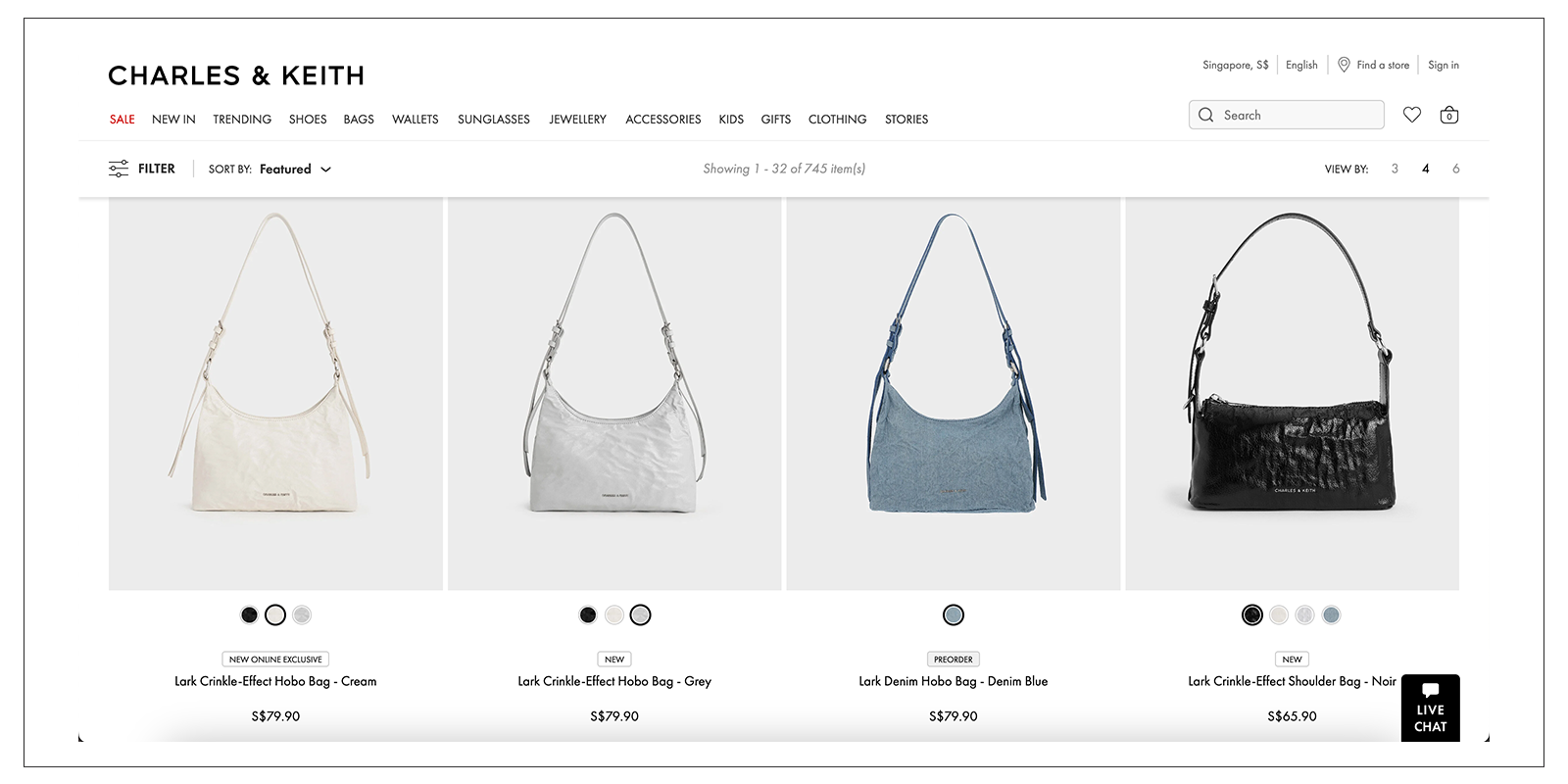
Consistent Product Thumbnails: Consistency in product thumbnails creates a clean and professional look. Ensure that all thumbnails are the same size and style. This uniformity makes it easier for customers to browse and compare products. Example: Charles & Keith, it naturally allows you to focus on only the bad colours and designs, because they unify the product placements, size, and strap heights.

-
Dynamic Content: Incorporate dynamic elements such as customer reviews, ratings, and stock levels. This information can influence purchasing decisions by providing social proof and a sense of urgency. Example: Zara typically displays all available colors on the PLP. Some colors are shown from the front, others from the back, and some feature models wearing the items. In other words, don’t rely on a single color and expect shoppers to click through to discover others. Show them all while they are browsing.
-
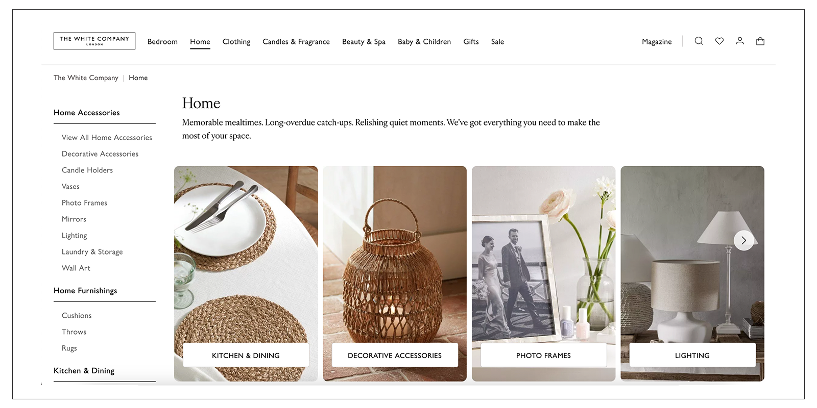
Contextual Imagery: Use images that show products in their intended context. For example, a photo of a sofa in a living room setting gives shoppers a better sense of scale and usability. Contextual images help customers envision how products will look and fit in their own lives. Example: The White Company, a leading home and decor brand in the UK, makes it effortless for you to envision how their products will look in your home.

-
Build a Brand Guideline for the Product Listing Page: Establish and follow a brand guideline to ensure consistency across your PLP. This includes color schemes, fonts, image styles, and overall layout. A cohesive look reinforces brand identity and enhances user experience. Example: Apple’s product listing pages (PLPs) maintain consistency through minimalist design and high-quality imagery. They utilize a specific white color tone as the background and provide product images with true-to-life proportional scale.
-
Use Icons or Frames for Navigation: Utilize icons or frames to help guide users to the right sections of your PLP. For example, use icons to represent different filters or categories. This visual aid simplifies navigation and enhances the user experience. Example: Sephora uses icons for filters such as “Best of 2023” or “NEW” to make navigation intuitive and user-friendly.
What’s next?
Optimizing your product listing page is essential for driving conversions and providing an excellent user experience. By implementing the elements and tips discussed above, you can create a high-converting PLP that not only attracts but also retains customers. Remember, the goal is to make the shopping journey as smooth and enjoyable as possible, guiding your customers effortlessly toward their next purchase. If you haven’t gotten the idea yet, dipp provides exactly what you need.
Get the limit offer here
