Understand A/B Testing and achieve the best results for your brand
No digital marketer is Mr Omniscient and no digital content is Mr Right. That's why A/B Testing is the only key to unlock your target audience's...
Great brands are recognized by millions of consumers - immediately. How is that possible? The answer lies in consistency and consistency lies in the heart of branding.
The first step to developing good branding for your business is creating a style guide. Read the article to learn more about our ideas on the topic.
Before defining a style guide, comes a clearly defined brand - a collection of customers’ perceptions regarding a given company. Having a brand defines your business and it is reflected in the way you communicate with the audience through content and visuals. In order to keep it consistent, you need to develop specific guidelines, both for internal and external use - and make sure that everyone is on the same page.
These guidelines are called a style guide. They include branding rules that help all the departments create and publish consistent visuals and content. They also ensure brand elements are used correctly when republished by third parties such as marketing agencies and journalists. Having a style guide helps keep a brand vision alive and makes sure that the audience understands your messaging properly. It includes both graphics and language to keep all the branding elements consistent - from visuals to texts.
Even though consumers often have little awareness of style guides - they are unconsciously attracted by a brand’s presentation. How? Making purchasing decisions dictated by emotions and the trust they have towards specific brands.
Style guides are born from branding concepts that need some kind of framework to keep their consistency. Therefore, the first 2 aspects to look at when developing a style guide are:
Every style guide should comprise two aspects - visual and linguistic. In order to construct the visual part, you should define the following elements for your brand:
The language aspect is expressed in an editorial part of the style guide and is undoubtedly just as important as its visual counterpart. It refers to such brand elements as articles, website copy, podcasts, social media posts or recruitment forms and includes such details as:
Thanks to the editorial style guide, everybody in the company understands how to speak for the brand to the public in order to strengthen brand consistency - and help the internal PR team which, naturally, needs to comply with the guidelines on the first place.
Many style guides are prepared both for offline and online usage, but let’s focus on the digital part solely. We’ve reviewed style guides from some of the most well-known brands and picked 3 that are worth analyzing when preparing your own one.
Medium
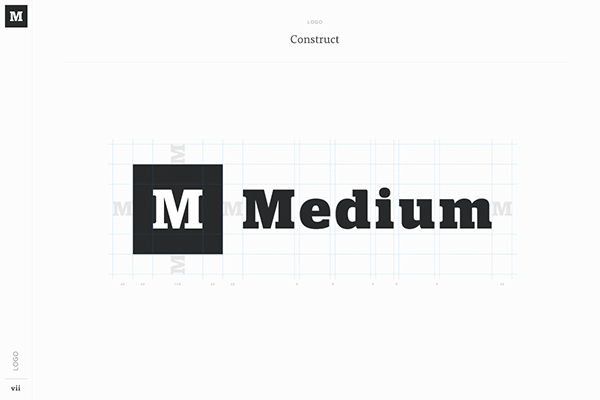
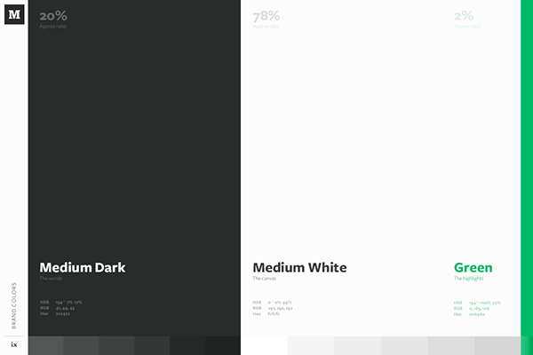
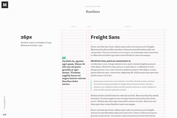
The popular online publishing platform very clearly communicates the structure of their logo, including details such as, the proportions between letters and required blank space around the logo in composition with other elements. Moreover, they created a comprehensible visualization of the text design together with e.g. distances between lines, margins and citation layouts. These, combined with other elements of the style guide leave no doubts about how to approach any task related to Medium’s visuals and keep their consistency.
Spotify
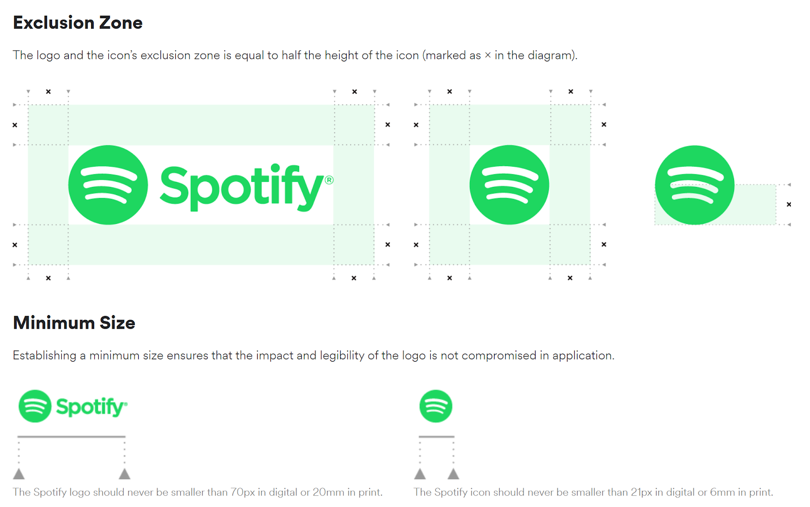
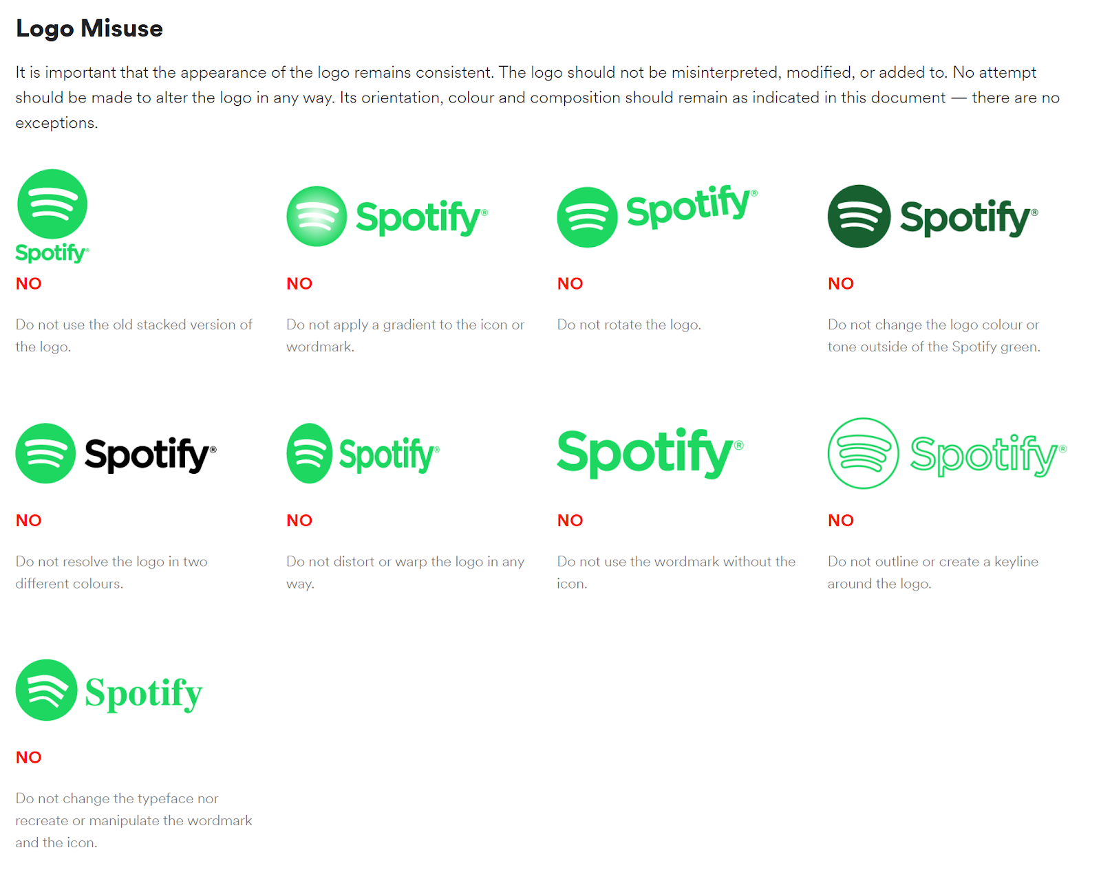
In the case of this famous digital music service, we paid attention especially to the highly understandable Logo Misuse section depicting the most common mistakes related to the logo usage. Moreover, the company provides a clear explanation related to the exclusion zone of all the logo variations - all kept in perfect visual consistency with the company’s branding.
 Shopify
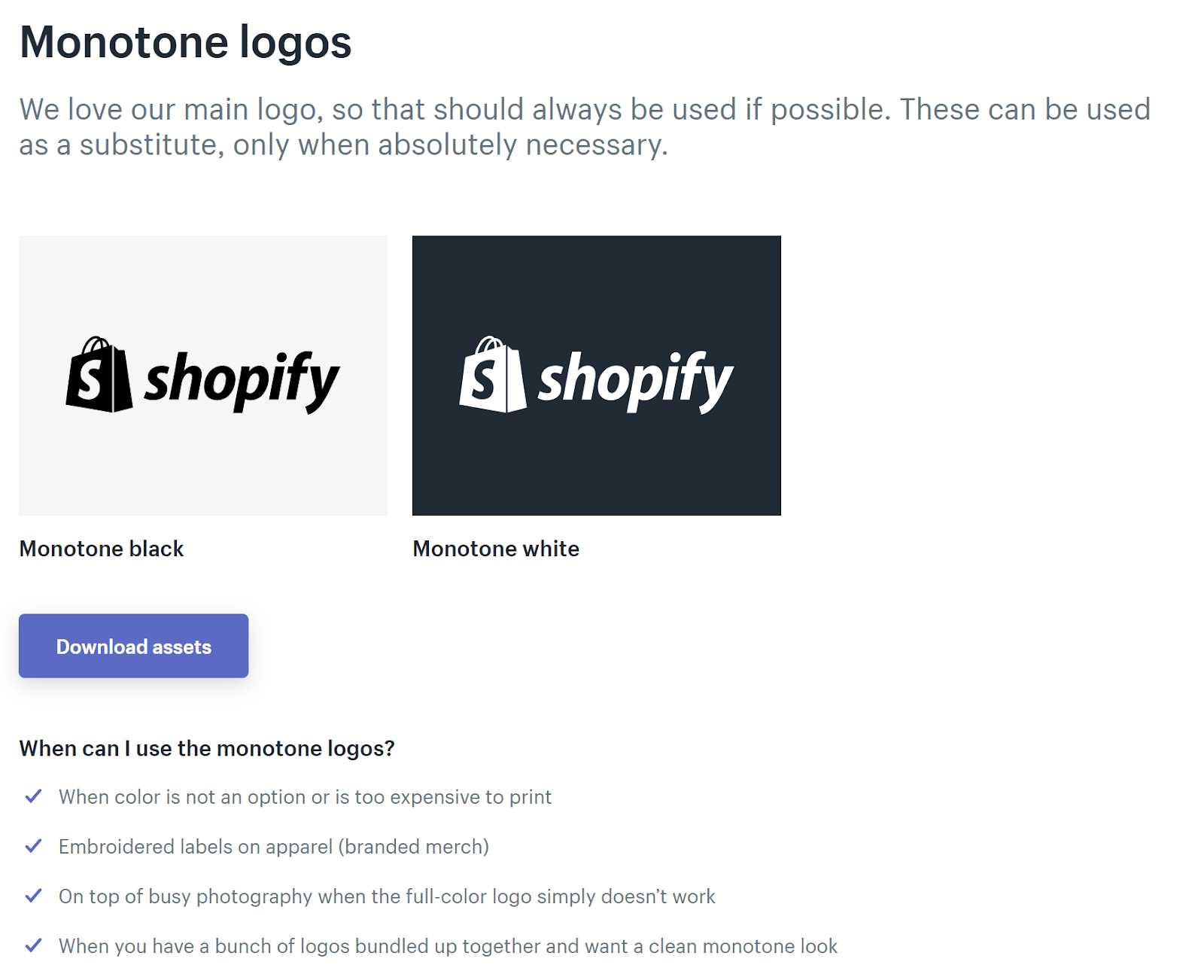
This E-commerce platform clearly indicates when one should use the glyph - and reserves it only for these particular conditions. Similarly, they explain when a monotone version of their logo can be used - giving useful examples of such situations. Thanks to this tactics, they make sure that these two possibilities are not mis- or overused. 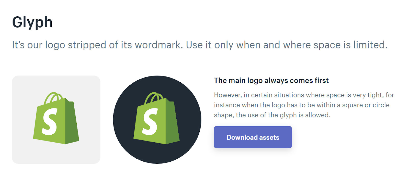
 Why a brand needs uniformity? The importance of style guide in marketing
Have you ever realized that great brands stick in your mind?
Because their consistency makes you see the same logo, colors, fonts and visual style multiple times.
According to a study by R.O. EYE, sales that had over one interaction brought on average 25% higher order values and purchasing online is characterized with an average of 3 interactions with a brand. Consumers that interacted with a brand 11 times before making a purchase, yielded 86% higher average order values than those who had only one interaction.
Therefore, with every interaction grows the sense of reliability and security that consumers have towards a brand. Complying with the style guide lets businesses:
There is a lot of talk going on about omnichannel strategies. Coherent branding ensures that customers recognize your brand wherever an interaction occurs - and their brains note it as a subsequent interaction. Therefore, creating visuals and content for all channels needs marketers, designers and other employees and contractors to comply with all the rules included in the style guide.
You have probably heard of brand personality before. The first association you might have with the word “personality” is a human being - and you’re right here. Consumers personify brands listen to what they say and observe how they present themselves visually, just like they do with other people. All the communication, e.g. content marketing or email marketing influences the way consumers perceive a given brand. If it’s not consistent, the audience doesn’t understand what a brand stands for and thus sometimes cannot decide whether it meets their expectations.
Moreover, on average customers don’t separate brands and companies from each other in their minds. Therefore, businesses use branding to express companies’ voices and communicate their way of perceiving the world to consumers. This way, they can meet consumers’ expectations and influence their purchase decisions.
Another important usage of a style guide is when a company goes through a process of rebranding. Not only do customers need to notice the new identity, but internal departments need to understand it and get used to it too. A well-prepared framework can help everyone get on board with the new direction smoothly and start implementing fresh branding in every piece of text and visual they create.
Modern times with dozens of interactions across consumers’ purchase paths make branding especially difficult. It makes staying uniform more important than ever. Moreover, even though large companies such as P&G, Apple or Coca-Cola have teams working from multiple locations, it doesn’t exempt them from applying the rule of consistency. Style guides published online makes it possible for every employee to check on the guidelines from any location. Leaving design and editorial decisions to individuals would take away all the cohesion a brand has. Communication would no longer be about unified goals and vision.
But... where do we notice branding online? Everywhere. Consumers note how you present the brand on your website, how you express messages on social media, how your landing pages are built or what is the layout of your digital banners - and many more. Both visual and editorial guides should be applied across all the channels and influence the way in which marketers and other professionals communicate the brand.
Visual content such as digital ads should always be designed according to general rules included in the style guide. In order to approach the process of ad creation, you need to analyze all the underlying elements such as fonts, colors, logo proportions and composition rules usually used for your business. Remember that an ad not consistent with your brand will not generate associations and, in the era of such a short attention span, might even get lost in the crowd and never get clicked. If a consumer has already had 3 interactions and is considering making a purchase, viewing a perfectly consistent ad might encourage him to check up on the final offer - and convert. Isn’t it exactly what every marketer wants?
A style guide is a set of rules that help marketers, designers, web developers and other professionals create content and visuals complying with a brand’s guidelines. In today’s world, unified editorial and design communication is key to gaining consumer trust and building brand reliability. Companies implementing the omnichannel strategy note a particular need to stay consistent in their messaging, as users having more than one interaction tend to make significantly more valuable purchases. No business wants to make its audience confused with its brand image - creating a professional style guide is the first step to implementing successful branding.
No digital marketer is Mr Omniscient and no digital content is Mr Right. That's why A/B Testing is the only key to unlock your target audience's...
There's no doubt that many likes make your brand look more credible, but it doesn’t say anything about the actual conversion.
75% of Indonesians are expected to spend 20% more in Ramadan. Products, like kitchen appliances, clothes, and cosmetics are expecting a boom in the...
Be the first to know about new B2B SaaS Marketing insights to build or refine your marketing function with the tools and knowledge of today’s industry.