Design tips
Turning your creatives into a modular production process
Take your existing creatives and turn them into a modular design system and automate your design process.
In this entry, we’ll look at some examples of successful key visuals and analyze what traits make them successful. Of course, we’ll also define what we mean by success and some of the factors we must take into account before starting the design process.
We’ll talk about how to build product key visuals for e-commerce that make the adaptation process easy and what are the basic composition rules that one can follow when creating key visuals. This way, your brand and product visuals stay consistent no matter what size or device they appear on.
Short disclaimer
We’re not discussing creativity, we’re strictly talking about how to efficiently and effectively broadcast a visual from an operations standpoint.
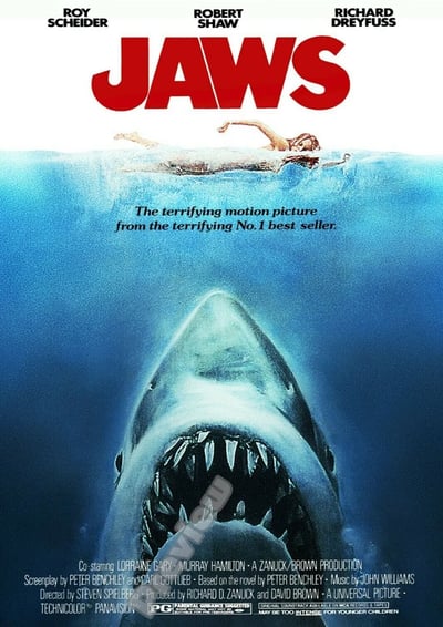
No, it’s not an e-commerce product, however, this is a very strong piece of key art for the reasons mentioned above. Let’s forget about the movie’s success (which greatly contributed to the recognizability of the artwork) for a second and focus on the formal properties that make it work so well.
The artwork is composed of 3 main elements stacked on top of each other and divided by the water line:
The shark
The girl and water line
The logo
The proportional relationship between the 3 elements is very dynamic. Large logo and a large shark sandwiching a very small girl. These 3 elements, combined with contrasting colors and proportional relationship make a very memorable composition.
Now, if we were to create multi-proportion banners to promote this movie today, they may look something like this:
The simplicity of this artwork gives it maximum compositional flexibility without losing any visual potency. In other words, no matter what size, what proportion or who the designer is, this visual will be instantly recognizable. Simple concept, simple execution naturally leads to very strong consistency.
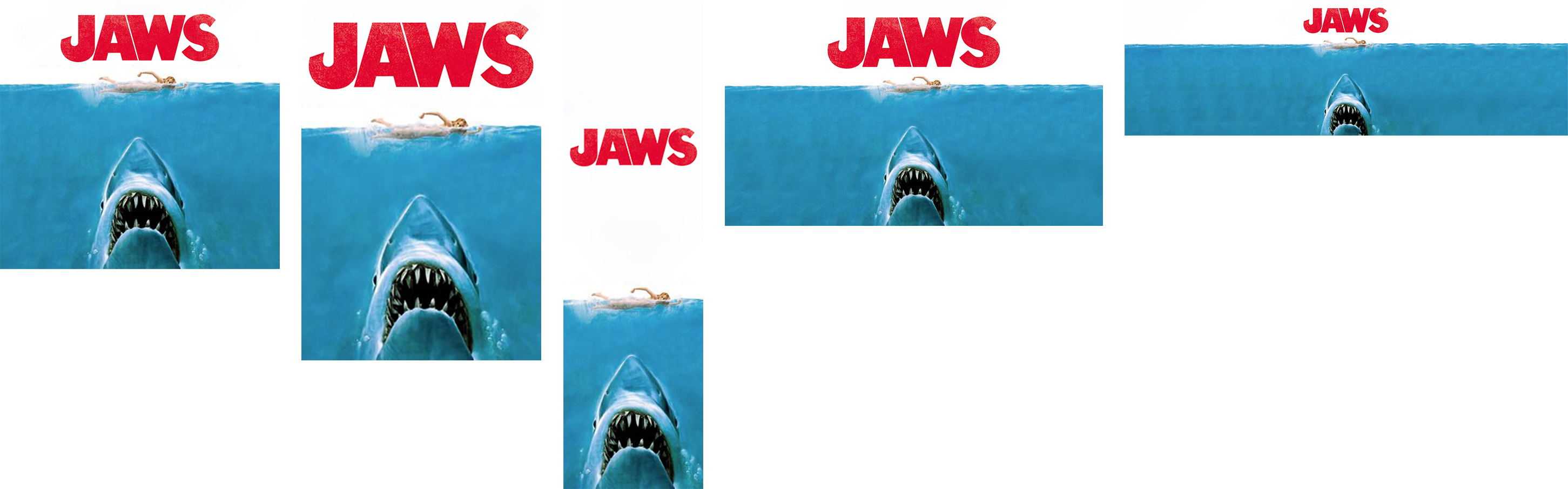
Let’s take a deep dive into at another example, with a more complex composition.


GTA V was an impossibly successful product, but that didn’t keep the game’s box cover art from being impossibly busy. The 10 visually complex elements (9 illustrations and a busy logo), composed in a very particular fashion, had to be re-sized into every size proportion imaginable while maintaining the same look and feel.
Despite the huge amount of visual complexity, the artwork stays consistent across different proportions because of the meticulous attention to consistency. Meticulous to the point of having a mathematical formula for calculating the size of the logo in relation to the canvas size, the thickness of border widths and shard angles (not to mention exactly where each illustration can be cropped). All this consistency keeps viewers from noticing the pretty drastic composition changes between different proportions. This painstaking attention to scale relationships between the 10 elements is what makes this very complex composition work.
Now, on to answer your question of how does this have anything to do with product thumbnails and lorikeets (product description page images)?
When it comes to e-commerce product visuals, the same principles apply. Since the goal of your typical e-commerce brand is to move as much volume of products as possible, visual consistency across different products becomes the main focus of a brand’s visuals.
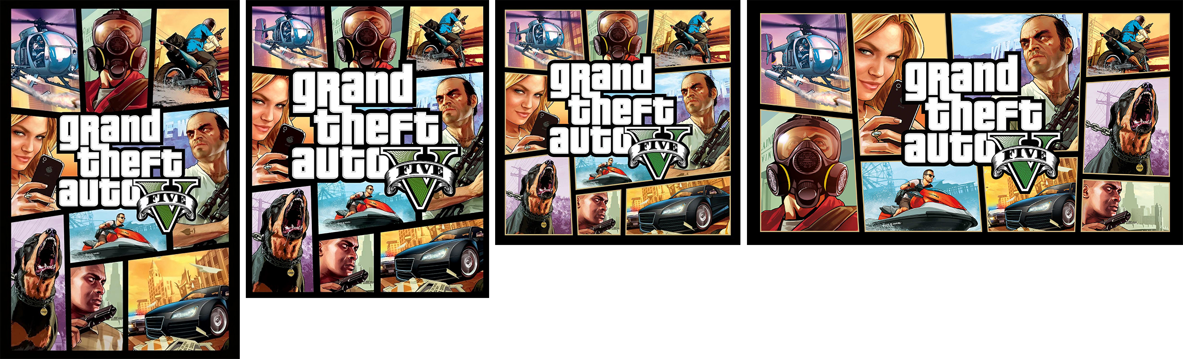
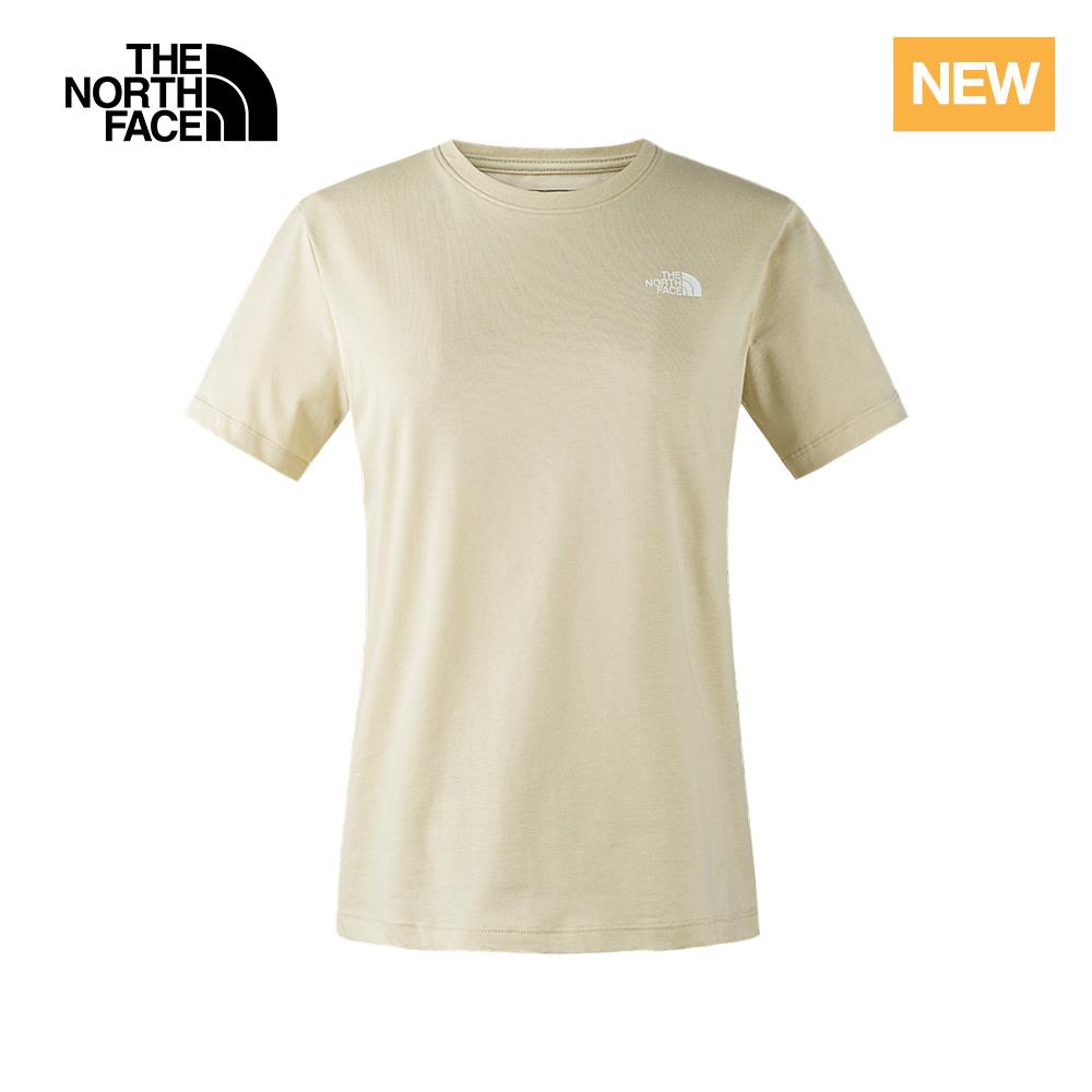
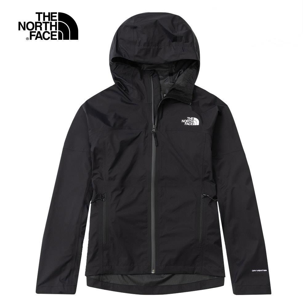
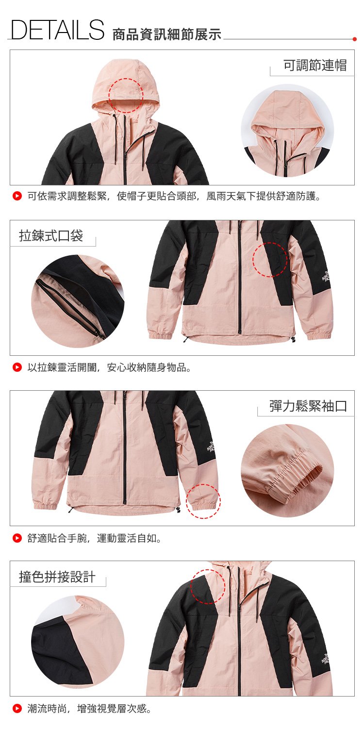
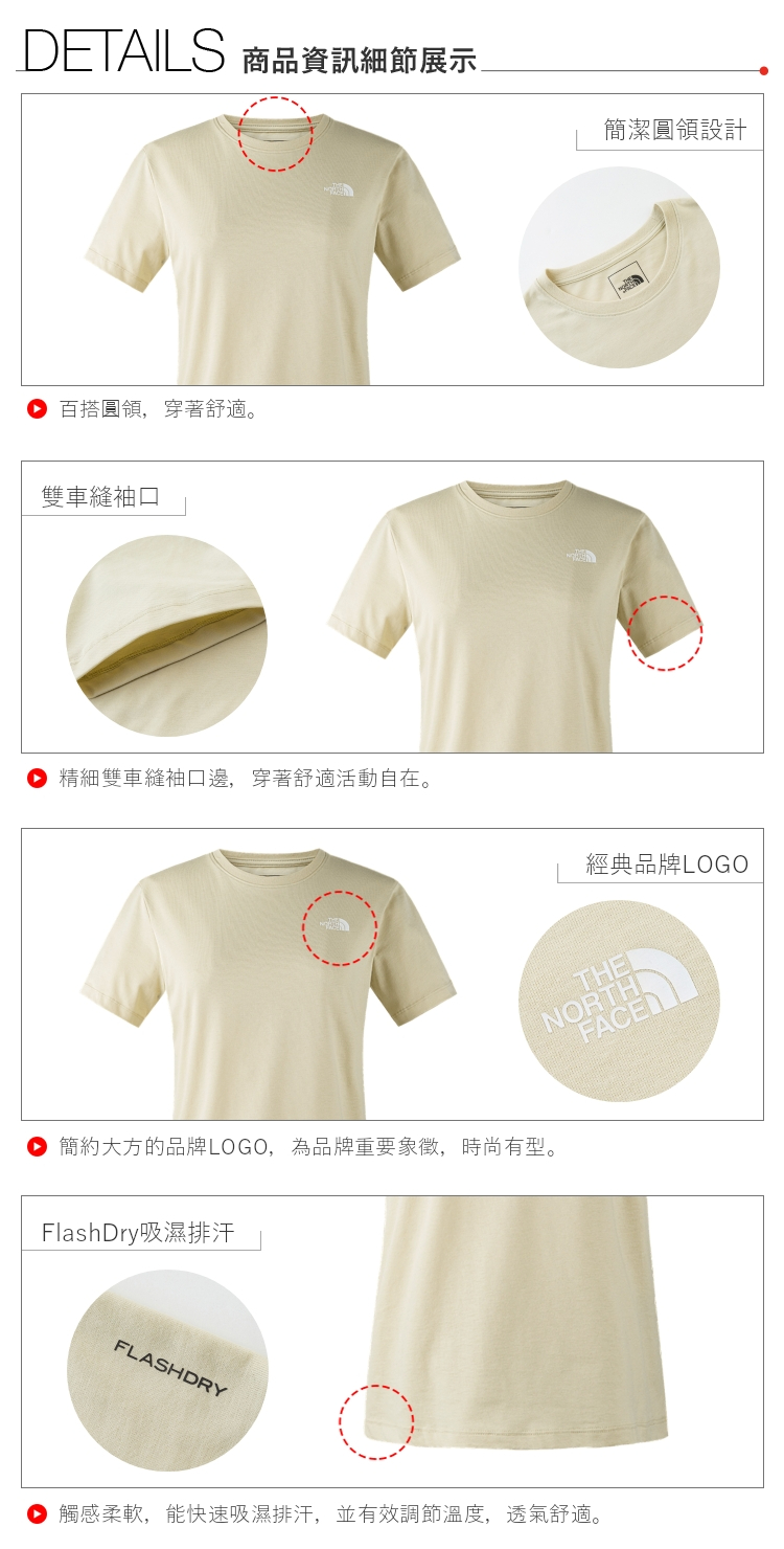
One example we can look at is The North Face Taiwan. There’s a constant feed of new products, new model photography and new deals that need to be launched regularly. With so much product variation, visual consistency is the only thing that can keep this e-commerce operation from becoming a complete mess.
 |
 |
 |
 |
 |
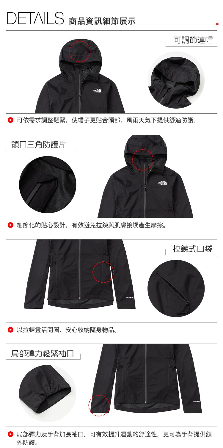 |
These thumbnails and product description images (lorikeets) for different products share identical layouts, logo placements, cropping styles and product highlight methods.
From the shopper’s perspective, consistently designed visuals provide a very friendly shopping experience as they optimize your catalog to be:
Easily scannable
Users have a subconscious heatmap when they are shopping to scan the page and quickly locate the information that’s relevant to them, thus no need to waste time reading through every line and looking at images.
Recognizable
When these same consistent visuals appear on other marketplaces, users will not wonder which brand they are looking at. Familiar-looking visuals will naturally remind them which brand they are shopping.
From the brand's perspective, consistent visual treatments will yield benefits as well, like:
Increase production volume
With a streamlined production process, a lot more visuals can be produced. This way brands can test which products, offers and features sell better.
Reduce production time
Brands can re-use the same layouts, use the same styling and only swap out the content to produce visuals in no time at all.
Improve overall brand consistency
Consistent, assembly-line-style production processes will inevitably lead to stronger brand awareness.
Now, when it comes to actually creating these visuals in Photoshop there are a few do’s and don’ts that we’d like to share to maximize your brand’s production capacity to produce product visuals.
Don't |
Do |
|
|
Think of your shoppers when creating product visuals. Make it easy to read, recognize and be predictable. The easier it is for the user to interact with your brand, the more comfortable they will feel, thus the more memorable your brand will become.
Think about your design system as one personality, not a collection of random behavior traits. Set a design system and stick to it no matter what size, which platform or which device your products are being sold on.
Think about how your design team can be more aware of your brand’s business goals and how they can produce visuals at speed and scale.
Thanks for reading, please leave a comment or suggestions on our linkedin page or email me directly.
Take your existing creatives and turn them into a modular design system and automate your design process.
The ability for a composition to take the shape of any size and proportion that's forced upon it and still communicate everything it has to convey.
Take your existing creatives and turn them into a modular design system and automate your design process.